
Project Summary
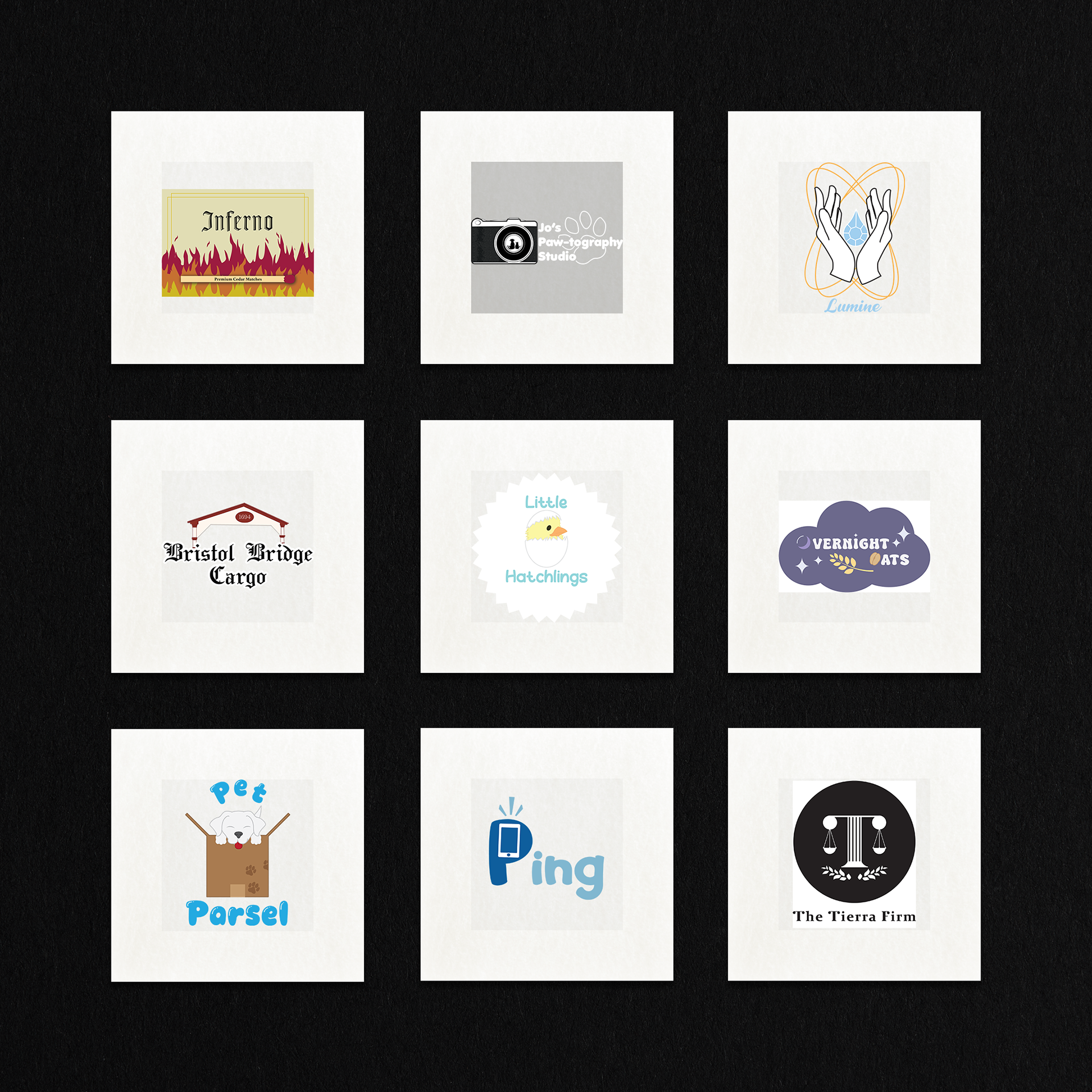
Over a 16-week period, I completed a comprehensive branding project focused on designing a series of nine unique logos, each developed in response to a specific creative prompt.
This collection was designed to enhance my proficiency in Adobe Illustrator, refining my branding techniques, and strengthening my creative thinking skills. Each logo challenge included tailored guidelines, such as required branding style, or conceptual themes--mirroring the kind of direction designers receive from real-world clients.
I took ownership of the entire creative process, from ideation to execution. The result is a cohesive and diverse portfolio piece that not only demonstrates my technical and conceptual versatility but also highlights my ability to meet client-driven goals with originality and professionalism.
Design Process
My design process starts with creating a brand name, which lays out the foundation for the visual and conceptual identity.
Once the name is established, I begin sketching around that central idea, experimenting with visuals that reflect the brand's essence and tone.
From there, I develop ideas for a color palette, fonts, and other key design elements that support the overall aesthetic and message.
The Final step is bringing all the elements together into a cohesive and visually compelling brand system that communicates effectively and resonates with the intended audience.
I'll use one of the prompts to help visualize one logo.
"You are to create a 1 1-letter monogram logo (aka a letterform). You get to pick who this letterform logo is for-- Maybe a business, a nonprofit, a school, a person, it's entirely up to you. You must name this client and develop a brandmark that is clearly the first initial while also incorporating visual elements."
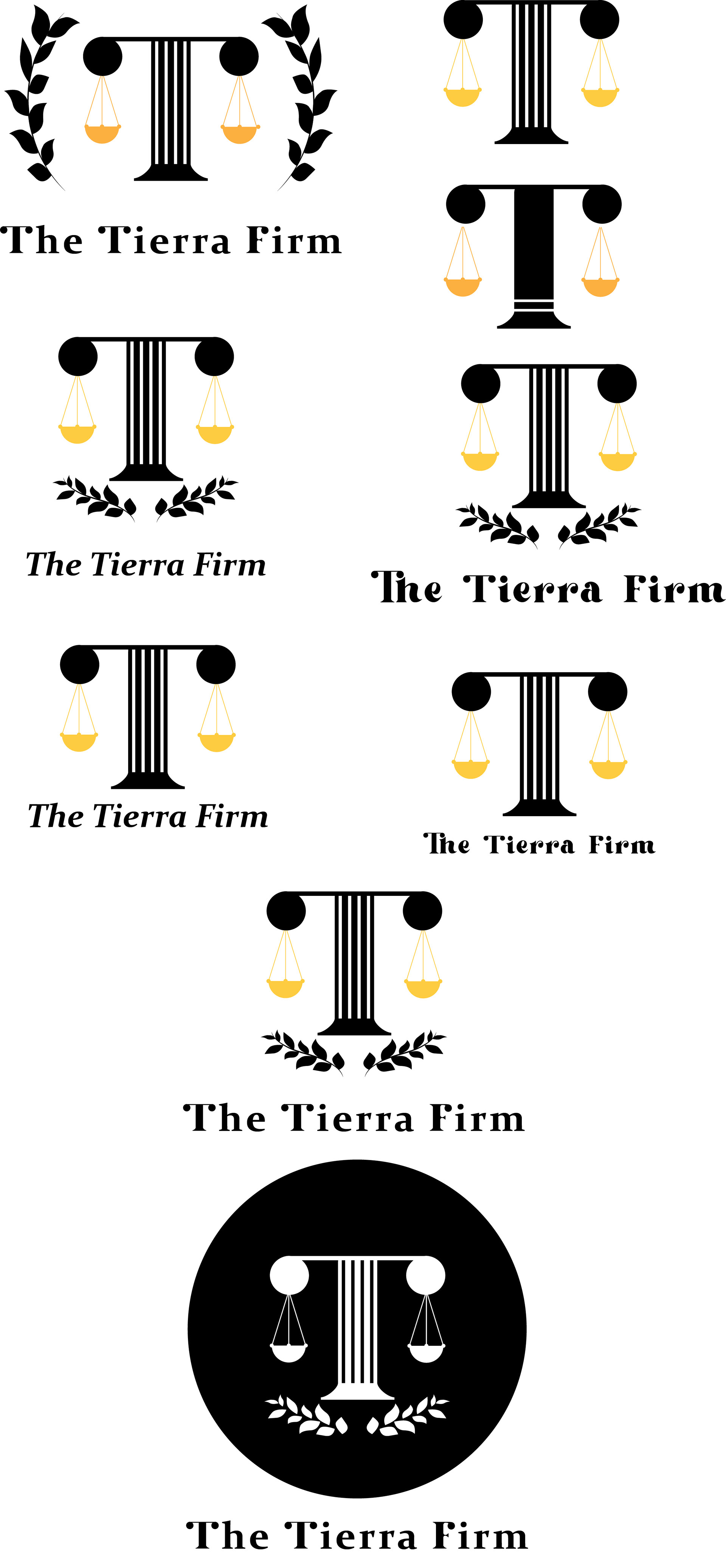
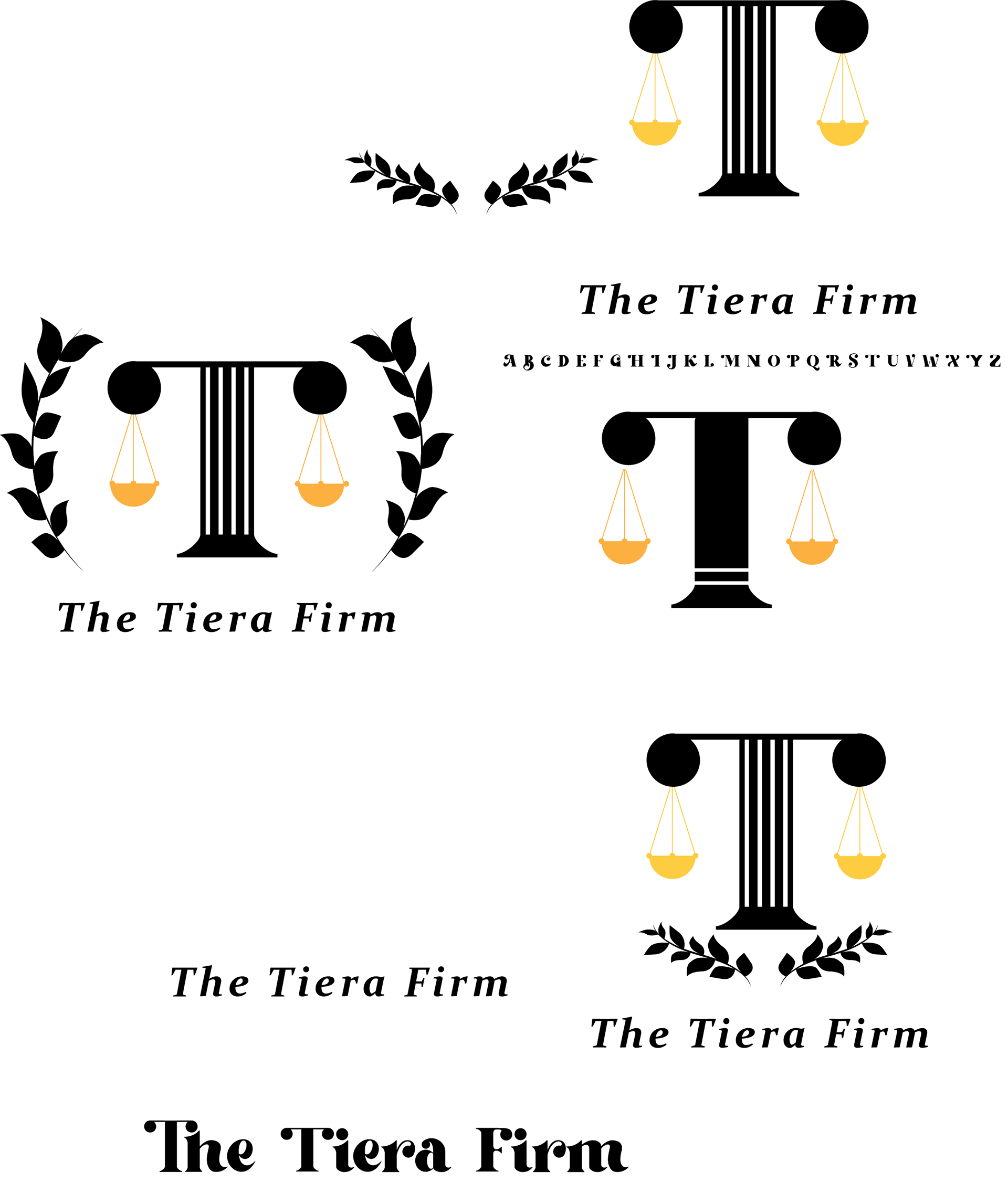
I was playing around in Illustrator for different types of ideas on how I would like to create a professional yet modern logo for a Law firm that specializes in environmental law, which is why I wanted to incorporate some sort of leaves in the logo. So I decided to scrap the color of the scale and just use an all black design with punched-out elements
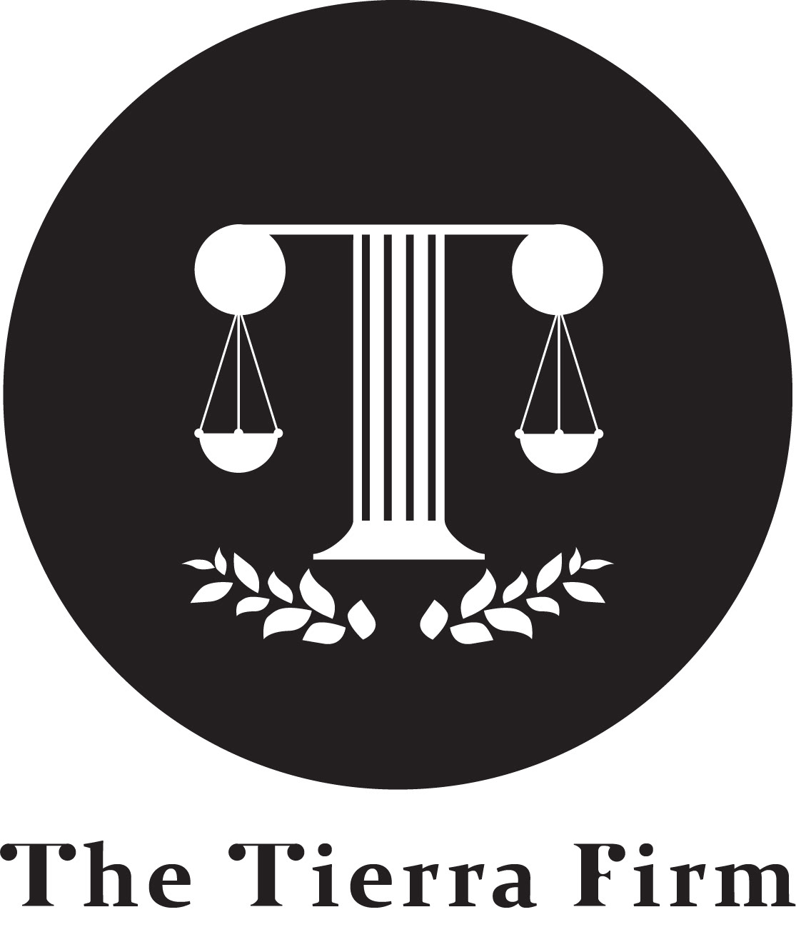
Completed Brandmark